The numbers 10 weeks after launch
56%
Up from 27% — exceeded 50% target
Full activation rate — users who completed KYC and made or received a first transaction
24%
Down from 61%
KYC abandonment rate — the core problem, more than halved
79%
Up from 41%
Camera permission grant rate — the single most dramatic improvement from a copy change
61%
Of Tier 1 Users
Tier 1 → Tier 2 upgrade rate — users opted in voluntarily after experiencing value
44%
Of Nigerian Users
Pidgin language toggle adoption — the highest-impact low-effort decision
2.1d
Down from 9.3 days
Average time to first transaction — users reached real value in days, not weeks
My Role
UX Research · Interaction Design · Compliance Collaboration · UX Copywriting · Localisation · Prototyping
Deliverables
Field Research Report
Journey Maps · Tiered KYC Design · Mobile Screens · Pidgin Copy System · Offline-Tolerant Flow Architecture
Team
Product Manager
UX Researcher
3 Engineers
Compliance Officer
Copywriter
Timeline & Platform
14 weeks
Android-first (91% of users)
iOS parity
Figma · Useberry · Notion
KEY DESIGN DECISIONS
Six decisions built for the real context.
01
The Kopa Promise Screen — Show the destination before the journey
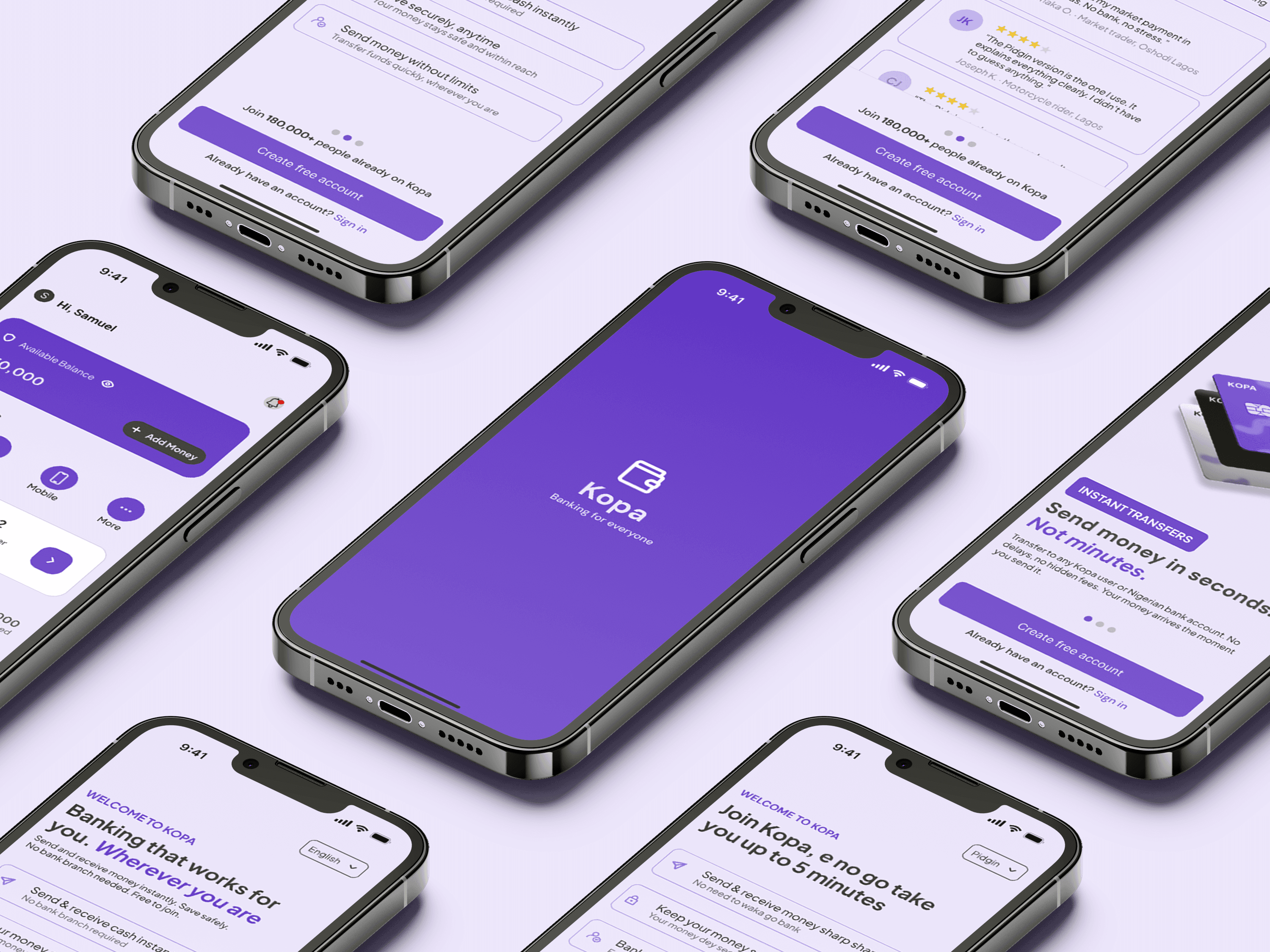
The very first screen after the splash screen is not a signup form. It shows what Kopa does — send and receive money instantly, save safely, free to join — with a single CTA. This answers the user's first unspoken question: "What is this and why should I bother?" The "5 minutes" framing sets a time expectation that reduces the perceived commitment of starting.
Onboarding Architecture · Trust Design
02
Tiered KYC Model — Earn before you ask
CBN and CMA tiered KYC regulations explicitly allow phased verification for low-value accounts. We designed around this compliance framework to let users receive their first payment before completing full identity verification, transforming KYC from a barrier into a progression system users opt into willingly.
Compliance Design · Activation · Trust
03
Camera Permission Screen — Explain before you ask
Before the selfie verification screen, a dedicated "Why we need your photo" screen appears. Three bullet points in plain language. Reassurance that the photo is encrypted and never shared. After this screen, the camera permission conversion rate increased from 41% to 79% — because users were primed rather than ambushed.
Trust Design · Permission UX · Anxiety Reduction
04
Nigerian Pidgin Language Toggle — Localise tone, not just words
A language toggle offering Nigerian Pidgin, Swahili, and English was added on the welcome screen. This was not a full translation, it was a tonal shift. In usability testing, Pidgin participants completed the flow faster and expressed significantly higher confidence. 44% of Nigerian users switched to Pidgin immediately.
Localisation · Cultural Inclusion · Language Design
05
Offline-Tolerant Flow Architecture — Design for the worst connection
Every completed step is saved locally, users who lose connection mid-flow return to exactly where they left off. Document uploads are queued and completed in the background when connection is restored. Invisible to the user, but it eliminated a significant source of silent abandonment caused by connectivity drops on low-end devices.
Technical UX · Accessibility · Constraint-led Design
06
Social Proof Integration — Make Kopa feel trusted by people like me
At two points in the flow — the welcome screen and immediately after Tier 1 activation — social proof elements were added. Illustrated testimonial cards with culturally grounded names and relatable stories. Designed as illustrations rather than photos, avoiding both privacy issues and the perception of staged testimonials.
Trust Design · Social Proof · Cultural Sensitivity
REFLECTIONS
What this project taught me
WHAT WORKED WELL
Going into the field rather than relying entirely on remote research was irreplaceable. The WhatsApp usability sessions were unconventional but gave us access to participants who represented the actual target user far more accurately than any recruited panel would. Seeing a user physically flinch when the camera permission appeared told us more than any survey response could.
WHAT I’D DO DIFFERENTLY
The language toggle was added late in the process — almost as an afterthought after a stakeholder suggested it. In hindsight, it should have been a first-principles decision made in week one. Localisation at the tonal level, not just the translational level, should be a core design decision for any product targeting linguistically diverse markets.
WHAT THIS TAUGHT ME
Designing for underserved users is not about simplifying a product — it is about deeply respecting the complexity of their context. The users we were designing for were not less sophisticated than a typical SaaS user. They were operating in more complex financial environments, with more constraints, and with higher stakes attached to every decision they made. The design had to match that seriousness while still feeling human.
THE MOST IMPACTFUL DECISION
Let users transact before they verify everything.
The single most impactful structural decision in this project was also the hardest to get approved. Instead of requiring full KYC before any account function, we introduced a tiered account model in collaboration with the compliance officer, mapped against CBN and CMA tiered KYC regulations.
The design argument was clear: a user who receives their first payment on Kopa at Tier 1 is far more motivated to complete Tier 2 than a user asked for everything before experiencing any value. Earn the trust, then ask for more.
Tier 1 — ENTRY
60 seconds
Phone number + PIN only
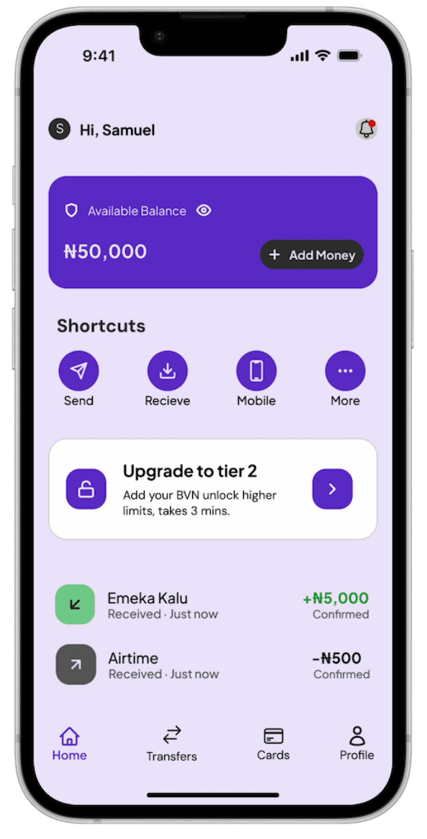
The minimum viable account. Users can receive money and view their balance, enough to experience real value before investing more time. No document uploads. No camera. No friction
Receive money
View balance
Up to 50,000/month
Send money
Higher limits
Savings
Loans
Tier 2 — VERIFIED
3 minutes
Add BVN or National ID
Triggered naturally after the user's first received payment, when motivation is at its peak. Sending money and higher limits unlock, making the upgrade feel like progress rather than a barrier.
Receive money
View balance
Up to 50,000/month
Send money
Higher limits
Savings
Loans
Tier 3 — FULL ACCOUNT
5 minutes
Selfie + Proof of address
Full account access, international transfers, savings, and loans. Users who reach this tier do so voluntarily, motivated by specific features they want. Completion rate is dramatically higher because users are choosing to upgrade.
Receive money
View balance
Up to 50,000/month
Send money
Higher limits
Savings
Loans
UX COPYWRITING
The words were doing real damage.
Working with a copywriter experienced in West African consumer communication, every screen in the onboarding flow was rewritten. The rule: if a market trader in Oshodi who didn’t go to school can't understand it immediately, rewrite it.
BEFORE
"Submit biometric verification"
"Provide proof of address documentation"
"Your data is processed in accordance with our privacy policy"
"Complete KYC to unlock full account features"
"Submit your Bank Verification Number"
AFTER
"Take a quick selfie so we know it's really you"
"Show us something with your name and where you live"
"Your information is safe with us. We will never sell it or share it without your permission."
"A few more details and your account will be ready"
"Your BVN helps us confirm your identity — it doesn't give us access to your account"
RESEARCH SYNTHESIS
Six findings that changed everything.
The field research, WhatsApp sessions, and funnel analysis converged on five structural problems, none of which were visible from the analytics alone.

The language barrier was invisible to the team
The app was written in formal English, the kind used in bank branches. Phrases like "Submit biometric verification" caused visible confusion. Participants read words out loud, paused, and then guessed
"Submit biometric verification? what does that mean? Is that the same as taking a photo?"

Users wanted to see the destination first
Every participant who abandoned the KYC flow did so because they didn't know what they were working toward. "Will I actually get an account after this?" came up in 9 of 12 sessions.
"I don't know why I'm doing all this. What do I get at the end?"

The camera permission was a major trust rupture
When the app requested camera access with no explanation, several users immediately closed the app. The request felt invasive — especially for users already primed by fraud experiences.
"When it asked for my camera I thought it was going to take a photo without me knowing."
Connectivity drops were causing silent failures
On devices under 2GB RAM, the app froze during document upload when connectivity dipped. Users assumed they did something wrong and abandoned. A technical failure was experienced as a user failure.
"It just stopped. I thought I pressed something wrong so I started again."
Social proof was completely absent
In the communities we visited, financial decisions are deeply social. The app had no testimonials, no community signals, and no sense that other people like them were already using and benefiting from Kopa.
"Has anyone else used this? I want to know it works before I put my details in."

Language toggling was an untested opportunity
During Lagos sessions, participants spontaneously switched between English and Pidgin when describing what confused them. When asked if they'd prefer the app in Pidgin, 9 of 12 Nigerian participants said yes immediately.
"If it talk Pidgin I go understand am better. English dey confuse person sometimes"
THE BUSINESS PROBLEM
40,000 people signed up.
Most never made a transaction.
Kopa launched with strong PR and a healthy waitlist. But conversion from waitlist to activated account was deeply disappointing. 61% of users who downloaded the app never completed signup. Of those who did, only 27% made or received a transaction within 14 days.
"The app felt like it wasn't made for me. Like someone built it for someone else and I was just supposed to figure it out."
— WhatsApp session participant, Lagos
The founding team had deep fintech experience, but mostly from building products for banked, urban, tech-savvy users. Kopa was their first attempt at designing for a fundamentally different user, and the gap was showing in every metric. The goal: Increase full activation from 27% to at least 50%, and reduce KYC abandonment from 61% to under 30%.
ACTIVATION FUNNEL FOR THE EXISTING FLOW
App Download
100%
Phone Verification
74%
Personal Details
55%
BVN Entered
42%
Camera Permission
28%
KYC Complete
39%
First Transaction
27%
BEFORE ANY WIREFRAME
We went to the market first. Not the design brief
Kopa had 40,000 users on a waitlist across Nigeria, Kenya, and Ghana. The product existed. The download existed. But 61% of users who opened the app never completed signup. The founding team had designed for banked, tech-savvy users. Kopa's actual users were different in almost every way that mattered.
Before touching Figma, the researcher and I spent time in the markets where Kopa's users actually worked. Oshodi and Alaba in Lagos. Gikomba in Nairobi. We observed, we talked, we tested. What we found changed the entire design direction.

LAGOS NIGERIA

Thumb-only navigation was the standard
Every user we observed in Oshodi navigated their phone with one thumb while doing something else, weighing goods, handling cash, carrying a bag. Thumb-only design wasn't an edge case. It was the entire use case.
91% of target users on Android with many on devices under 2GB RAM
NARIOBI, KENYA

Data was expensive and purchased in tiny bundles
Users in Gikomba bought data in KSh 50 bundles. Every screen that loaded slowly, every heavy animation felt like it was costing them money. Data cost wasn't a UX consideration, it was a trust one.
Ksh 50 Typical data bundle — slow screens felt like a cost to the user
📱
WHATSAPP SESSIONS

12 usability sessions via WhatsApp video call
We couldn't bring Oshodi traders into a lab. So we brought the lab to them — screen-share sessions over WhatsApp video with participants in Lagos, Nairobi, and Accra. Unconventional. But it reached users a formal panel never would.
"When it asked for my camera I just closed it. I thought it was taking a photo without
me knowing."

TRUST FINDING

Distrust of digital finance was rational, not irrational
Multiple participants had been victims of fraud via fake banking apps or USSD scams. Their suspicion of new financial products wasn't technophobia — it was lived experience. The design had to earn trust explicitly at every step.
"I wasn't sure they wouldn't take money from my account. The bank statement part
scared me."
Kopa
Bringing 40,000 Underbanked Users
Into Digital Banking With Kopa
Designed a trust-first onboarding experience for first-time digital banking users across Nigeria, Kenya, and Ghana with tiered KYC, Pidgin language support, and offline-tolerant flows.
Let’s build something
people actually use
I'm currently open to full-time roles and select freelance engagements in product design. Particularly in Fintech, Neobanking, and B2B SaaS. If you're working on a product where onboarding, activation, or retention is a growth lever, I'd love to talk.
SCREEN GALLERY
Here’s what our screens looked like
in the end

WELCOME SCREEN

THE KOPA PROMISE

NIGERIAN PIDGIN VERSION

SOCIAL PROOF
DASHBOARD