THE PROBLEM
Strong signups. Terrible conversion. A classic SaaS leaky bucket.
Trackify is a B2B analytics platform for e-commerce businesses, a single dashboard for tracking revenue, customer behaviour, and marketing ROI. Their content-led growth strategy was working. Signups were healthy. But the conversion from free trial to paid subscription was sitting at a painful 9%, well below the 15–25% industry benchmark for tools in this category.
When the team dug into the data, the pattern was consistent: most users signed up, explored briefly, and never came back. They were churning silently before they ever experienced the core value of the product. The business was pouring resource into the top of the funnel and losing it all in the middle.
"People sign up because they believe we can help them understand their business. But somewhere between signup and that belief becoming real, we lose them."
— Trackify CEO, project kickoff
The goal: Redesign the post-signup experience to increase trial-to-paid conversion from 9% to at least 18% within two product quarters. Getting there required answering one question first, what does Trackify's aha moment actually look like?
Trial user drop-off — existing flow
Trial signup
100%
D1 Return visit
62%
Integration done
34%
First report built
18%
D14 still active
31%
Converted to paid
9%
DISCOVERY AND RESEARCH
Finding the aha moment, then building everything around it.
Before designing anything, I needed to answer a foundational question: what single behaviour most reliably predicted that a trial user would convert to paid? Working with the data analyst and Mixpanel, we ran a correlation analysis between user behaviour during the trial period and conversion outcomes.

NORTH STAR FINDING
Users who created their first custom report within 72 hours of signing up converted to paid at 3.4× the rate of those who didn't.
This became the north star. Every design decision in the redesign pointed at one outcome: get users to their first custom report within 72 hours of signup.
Empty dashboard syndrome
Session recordings showed users landing on a dashboard full of placeholder charts. It looked impressive in demos but felt hollow when it was clearly not their own data. Most left within 90 seconds.
"It felt like a template, not a product I owned."

No guided path forward
The nav had 9 items at identical visual weight. New users had no clear "start here" signal. Many clicked into Reports, found nothing, and left without taking any action.
"I didn't know where to begin. I just poked around and gave up."

Integration buried 3 clicks deep
Connecting a data source, which was the most critical first action, was hidden under Settings → Integrations → Data Sources. Users who needed to connect their Shopify store had no idea where to find it.
"I couldn't even find where to connect my store."

Integration lag caused silent churn
For users who did find the integration, data syncing took 15–30 minutes. With no feedback or sample data to explore in the meantime, users left and never returned.
"I connected it, waited, saw nothing, and assumed it was broken."

Checklist was ignored
An onboarding checklist existed but was small, tucked in the bottom-left corner, and never surfaced contextually. In 40 session recordings reviewed, not one user interacted with it spontaneously.
"I never even noticed there was a checklist."

Blank canvas paralysis
Users who found the Reports section faced a blank creation interface with no templates, no examples, and no guidance. The cognitive load of "what do I even build?" drove most to abandon immediately.
"I clicked New Report and had no idea what to do next."

THE EXPERIENCE AUDIT
What the old experience got structurally wrong.
The existing post-signup experience was designed around the product's feature architecture — not the user's activation journey. Every structural problem mapped directly to a measurable drop-off point in the funnel.
BEFORE: WHAT BROKE ACTIVATION
Empty dashboard with placeholder data, no sense of personal ownership or immediate value
Integration hidden in Settings — the most critical first action was 3 clicks away from the homepage
No data during sync lag — 15–30 min wait with no feedback caused silent abandonment
Onboarding checklist visually buried — zero contextual triggers to bring it back into focus
Report builder was a blank canvas — no templates, no examples, no starting point
Hard paywall at day 14, users felt ambushed, causing panic-churn on the final day
AFTER: WHAT DROVE ACTIVATION
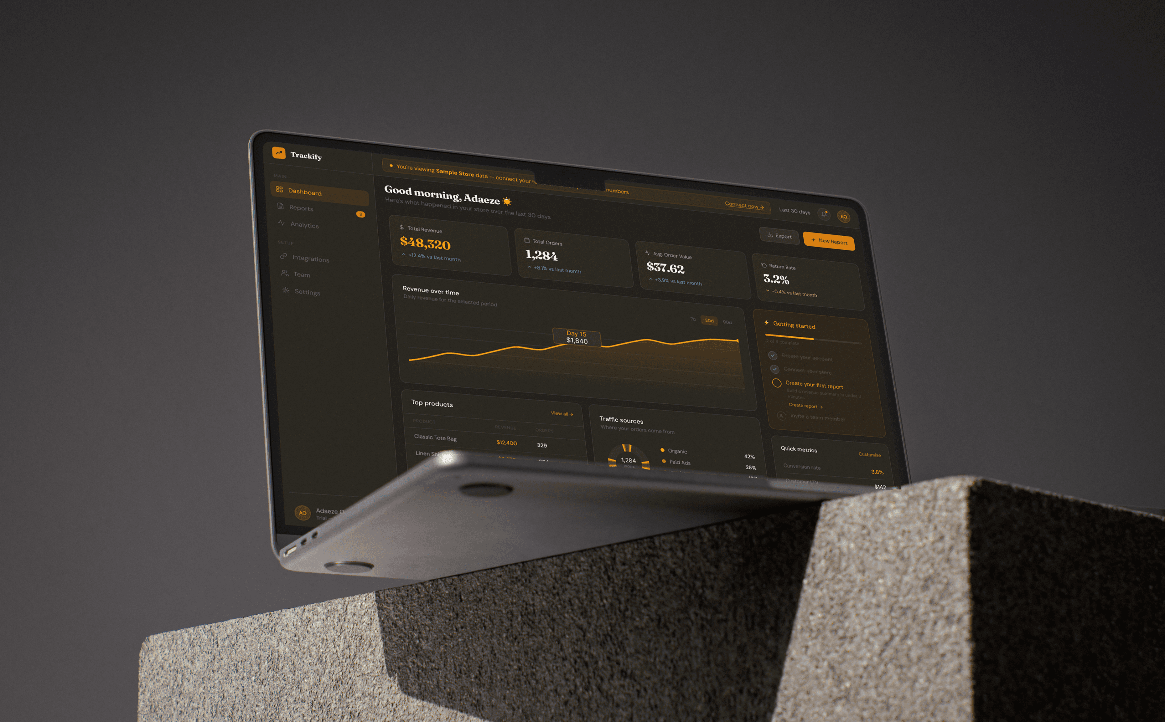
Intelligent sample data populates the dashboard immediately — users explore a real-feeling product from minute one
Integration surfaced as a first-screen priority in the new 3-step welcome flow — one click, full focus
Sample data keeps users engaged during sync lag — the wait becomes invisible
Persistent activation sidebar replaces the checklist — always visible during the trial, with inline CTAs
Guided report builder with templates — users go from blank to first report in under 3 minutes
Graceful trial expiry — personalised value summary, plan selector, read-only mode instead of hard lock
The empty state problem redesigned
Every empty state in the product was treated as a missed activation opportunity and rebuilt from scratch.


Before — Dead end
AFTER: ACTIVATION PROMPT
KEY DESIGN DECISIONS
Six decisions that moved the conversion needle
01
The Welcome Flow was Personalised from the first interaction
Instead of dropping users onto an empty dashboard, a 3-screen welcome flow was introduced immediately after email verification. Screen 1 asked what kind of business they run (Shopify, WooCommerce, Agency, Other). Screen 2 asked what they most want to track. Screen 3 surfaced the integration as a single-focus, full-attention step. This flow takes under 90 seconds and immediately signals that Trackify is building something for them, not showing them a generic product.
PERSONALISATION . ONBOARDING ARCHITECTURE
02
Intelligent Sample Data was Added to Make the product feel real before their data loads
For users who skipped the integration or whose data hadn't finished syncing, the dashboard now populates with realistic, clearly labelled sample data: "Sample Store — your data will appear here." This single change eliminated the integration lag abandonment problem entirely. Users could explore, build a report using sample data, and develop a concrete understanding of the product's value, before their own numbers even arrived. It turned a 15-minute wait into an invisible background process.
Retention . Perceived Value . Onboarding
03
A Persistent Activation Sidebar Replaced the buried checklist with something that works
The buried checklist was replaced with a persistent activation sidebar, a focused right-side panel visible throughout the trial period only, containing exactly 4 steps: create account, connect data source, create first report, invite a team member. Each step expands inline with a direct CTA — no navigation required. Completing each step triggers a small celebration and fills a visible progress bar at the top. The sidebar disappears permanently once all steps are completed or the user converts to paid.
Activation . Progressive Disclosure . Interaction Design
04
Adding a Guided Report Builder, Solved the blank canvas paralysis
The report creation experience was redesigned from a blank canvas into a guided builder. Users choose a template (Revenue Summary, Marketing Performance, Customer Overview), select a date range, and hit generate. The report populates in seconds. This reduced the cognitive load of "what do I even build?" and collapsed time-to-first-report from 3.2 days to 6.4 hours. The template system also had the side effect of teaching users what good reporting looks like, accelerating their understanding of Trackify's full value.
Activation . Cognitive Load Reduction . Feature Design
05
Graceful Trial Expiry — Value-first, not paywall-first
Instead of a hard paywall at day 14, the trial expiry was redesigned as a staged, respectful transition. Day 10: a personalised summary of what the user had built during their trial, reports created, data connected, insights found. Day 13: a plan comparison modal pre-selecting the most relevant plan based on their usage. Day 14: read-only mode, full access to everything built, with a persistent one-click upgrade path. This felt respectful rather than punitive and significantly reduced the panic-churn caused by users feeling ambushed at the paywall.
Retention . Conversion . Paywall UX
06
Team Invite Hook was Added to Drive multi-seat adoption to anchor retention
In B2B SaaS, multi-seat usage is one of the strongest predictors of long-term retention. When more than one person at a company uses a tool, churn drops dramatically. An invite prompt was introduced at two strategic moments: immediately after a user creates their first report (peak satisfaction), and on the trial day 7 check-in email. Multi-seat signups increased from 11% to 28% of converting accounts within the first quarter post-launch.
Retention . Growth . Feature Adoption
ACTIVATION JOURNEY
The 14-day trial — redesigned as a journey, not a countdown.

Day 0 — Signup
Welcome flow + integration prompt
3-screen personalisation flow. Integration surfaced immediately. Sample data populates dashboard within 30 seconds. Activation sidebar appears with 4 clear steps.

Day 1–3 — North Star Window
Drive first report creation — the critical 72 hours
Contextual tooltips guide users toward the Reports section on first visit. Guided report builder removes blank canvas anxiety. In-app celebration on first report completion.

Day 7 — Mid-trial check-in
Team invite prompt + NPS survey
Post-first-report team invite. Single-question in-app NPS. Scores below 7 trigger a CS outreach within 48 hours. Feature discovery prompts begin for users who've completed core steps.

Day 10 — Value summary
Personalised "what you've built" email
Reports created, insights found, data connected — shown back to the user as a tangible summary of value. Not a sales pitch. A reflection of what they'd lose.
Day 13 — Plan selection
Contextual upgrade modal — pre-selected plan
Modal appears with usage-matched plan highlighted. No pressure language. Clear comparison. One-click upgrade path.

Day 14 — Expiry
Read-only mode, not a hard lock
Full access to everything built. Persistent upgrade banner. No data loss messaging. Users who haven't upgraded can still see and share what they've created — removing the main objection to continued engagement.
The numbers 10 weeks post-launch
21%
Up from 9% — exceeded 18% target
Trial-to-paid conversion — the headline metric the entire redesign was built around
67%
Up from 18%
First report creation rate — the north star behaviour that predicts conversion
6.4h
Down from 3.2 days
Average time to first report — aha moment reached in hours, not days
72%
Up from 34%
Integration completion rate during the trial period
54%
Up from 31%
D14 retention — users still active at the end of the trial period
28%
Down from 11%
Multi-seat signups among converting accounts — the strongest retention signal
SCREEN GALLERY
The moments that drove the conversion

01. WELCOME FLOW

02. DASHBOARD + SAMPLE DATA

03. GUIDED REPORT BUILDER

04. GRACEFUL TRIAL EXPIRY
REFLECTIONS
What this project taught me
WHAT WORKED WELL
Anchoring the entire redesign around one north star metric — first report within 72 hours — kept every design decision focused and every stakeholder conversation grounded. When feature ideas came up, the question was always simple: does this get users to their first report faster? That clarity is what made the project move quickly.
WHAT I’D DO DIFFERENTLY
IThe welcome flow added friction for users who already knew exactly what they wanted to do. In hindsight, I'd include a "Skip setup, take me straight to the dashboard" option from screen one. Returning or experienced SaaS users shouldn't have to sit through a personalisation flow they don't need.
WHAT THIS TAUGHT ME
In B2B SaaS, the onboarding experience is a sales conversation. Every screen is an opportunity to demonstrate value, reduce doubt, and reinforce the user's decision to try your product. Design that forgets this ends up building beautiful empty rooms — impressive to look at, useless to live in.
"The most powerful thing we did in this project wasn't a layout change or a new feature. It was deciding what the product is actually trying to get users to do, and then making every single screen point at that thing. One metric. Ruthlessly pursued."
— Emmanuel Amaechi, Lead Product Designer
My Role
UX Research · Activation Design · Visual Design · UX Copywriting · Usability Testing
Deliverables
User Journey Maps
Funnel Analysis
High-Fidelity Designs
Empty State System
Trial Expiry Flow
Team
Product Manager
Growth Analyst
2 Frontend Engineers
Data Analyst
Timeline & Platform
8 weeks
Web — Desktop-first
Responsive
Figma · FullStory · Mixpanel
Trackify
Doubling Trackify's Trial Conversion Through Smarter Activation Design
A full redesign of the post-signup experience for a B2B analytics platform, anchored to one north star metric and built to get users to their aha moment in hours, not days.
Let’s build something
people actually use
I'm currently open to full-time roles and select freelance engagements in product design. Particularly in Fintech, Neobanking, and B2B SaaS. If you're working on a product where onboarding, activation, or retention is a growth lever, I'd love to talk.